How does a freelancing designer specializing in branding go about rebuilding their visual identity? Why would they do it? What are some outcomes we might expect and how do we measure success?
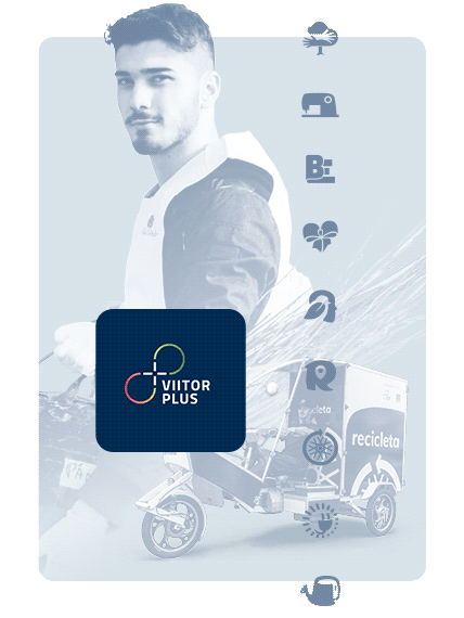
Hey there, my name is Bogdan Moga, I'm a senior communication designer based in Berlin. My work connects communication teams with their audiences: focusing on editorial design and branding, contributing to brands like Verifone, start-ups and non-profits, for more than two decades.

Let's Start with "Why"
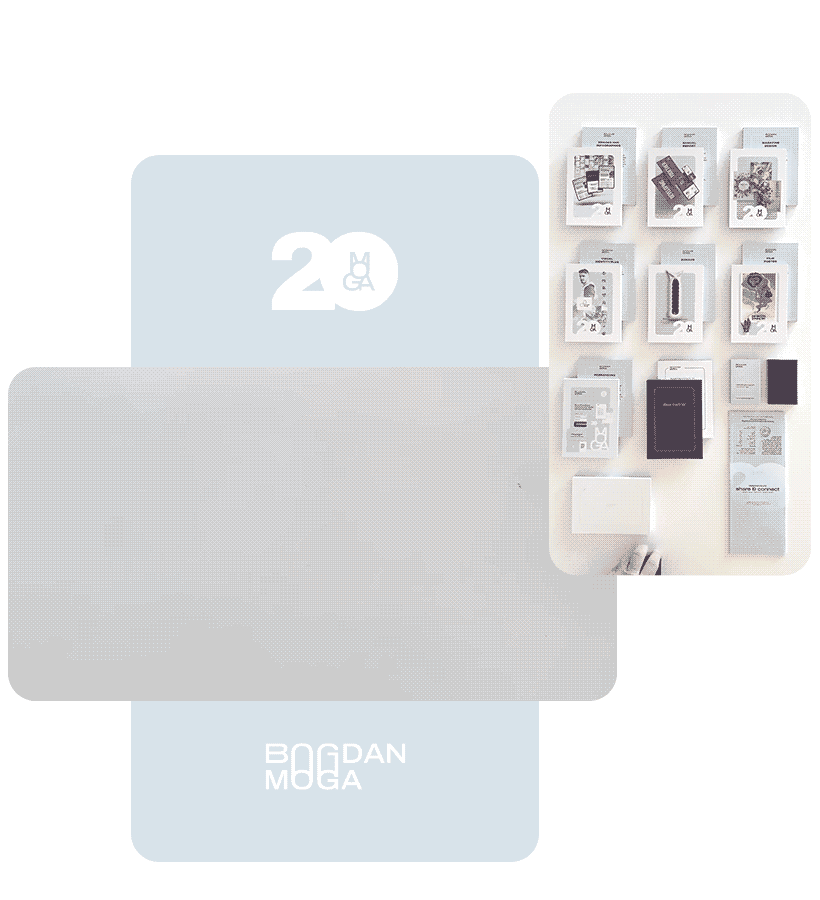
The main reason for doing this project is to let the world know that I've reached a milestone. That I've been focusing on creating visual communication, doing awarded and highly recommended work. And that I've been doing it for 20 years.

Do it as an invitation to dialogue, as the spark for an exchange of ideas. It's not about tempering chocolate, it is about starting a conversation, to adapt a famous quote.

Considering that we can influence views and ignite thoughts, and that they in turn touch attitudes and intentions. And that this exchange contributes to our view of the world in some small way.

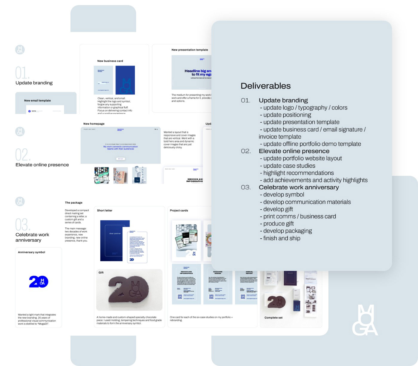
So what am I hoping to achieve? I have three objectives here: A. Establish my design practice as an experienced, trusted, and effective solution; B. Offer insight into the creativity, reliability and dedication my partners enjoy; C. Showcase deep understanding, strategic approach and diligent diversity.

Method Employed: the "How"
Using a strategic approach. Doing a deep introspective dive to lay the foundation for identity work. What have I achieved? What are my strengths and values? How do I best communicate them?
I realized that one of my best achievements is the relationship I enjoy with my partners. This is why some of my working relationships go back decades. As a consequence, I received a significant number of glowing recommendations. I decided to focus on that.
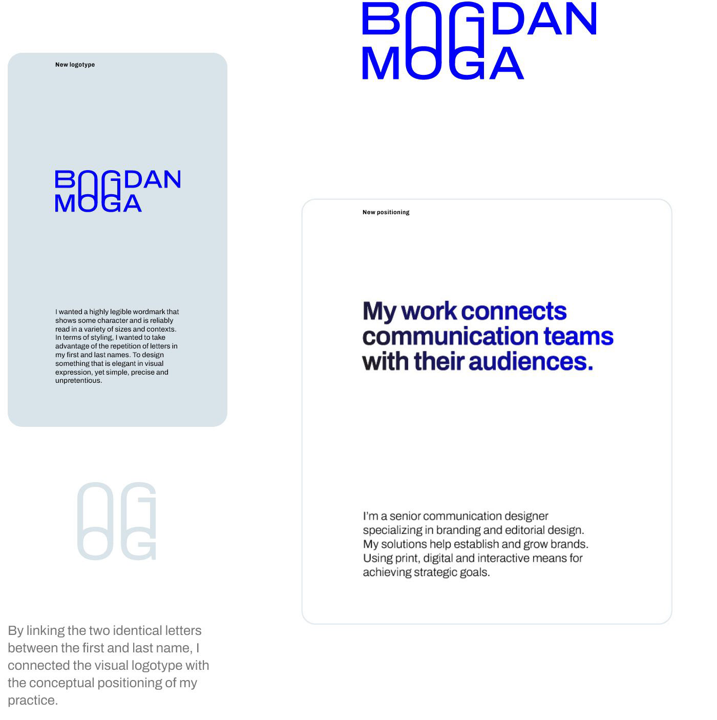
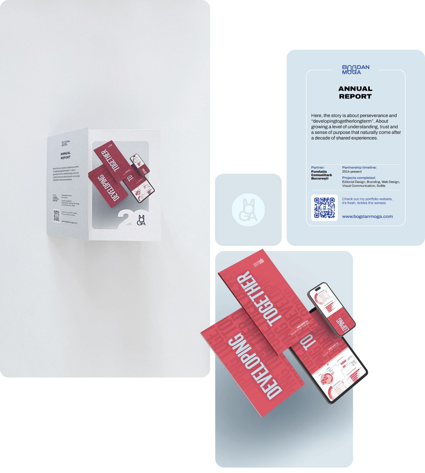
I needed an identity system that is distinctive, something that is bold when needed and quiet when used to highlight client design work. I wanted a flexible, modern and well adapted type family to help modulate the styling and work under different conditions: print and digital, with proper and specific language support.

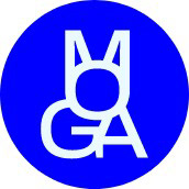
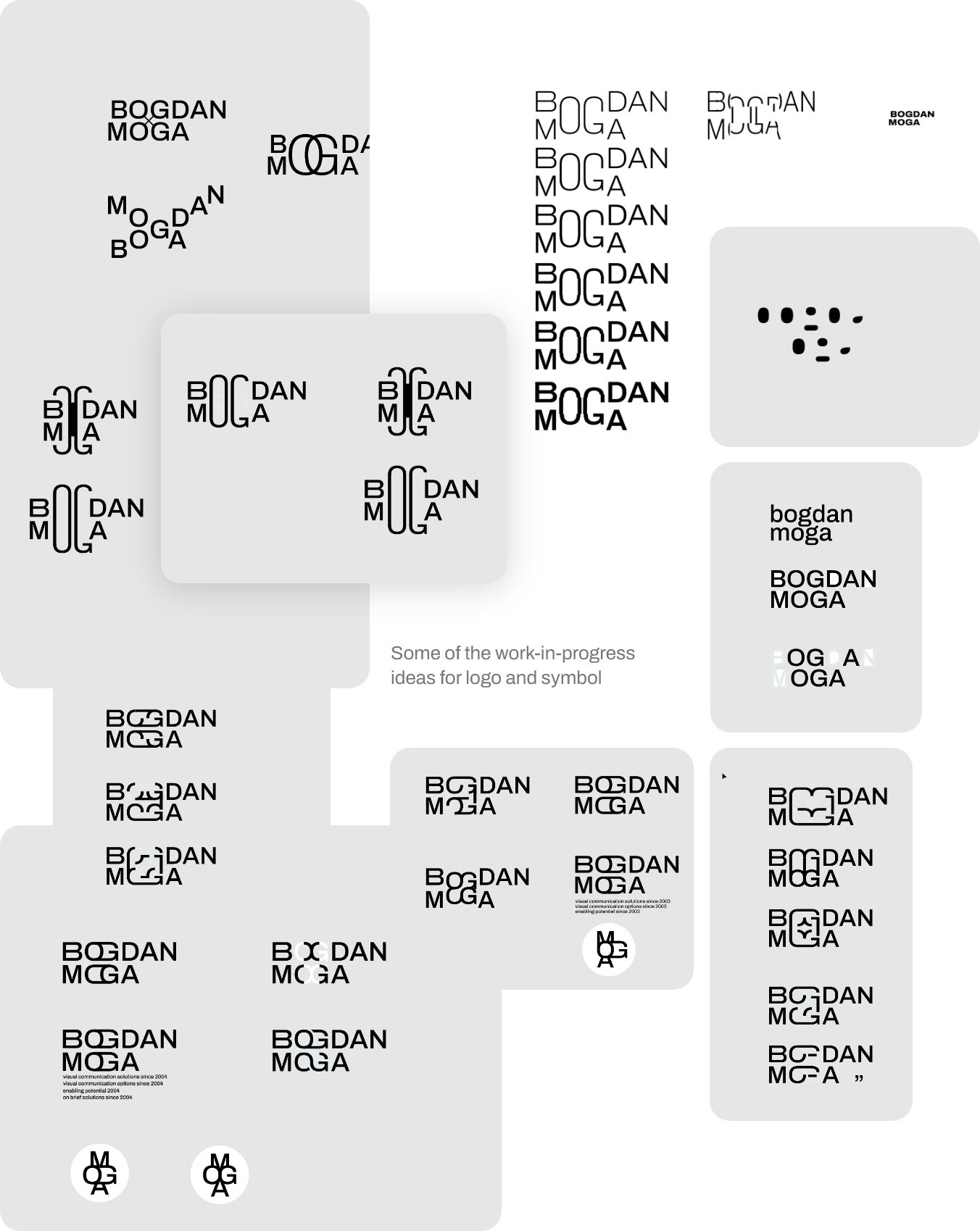
I wanted to take advantage of some particularities of my name. The fact that the second and third letters of my first and last name are identical was interesting and distinctive. I did a lot of digging to find a visual solution that was elegantly simple. This work helped me figure out the key word of my new identity: connection.
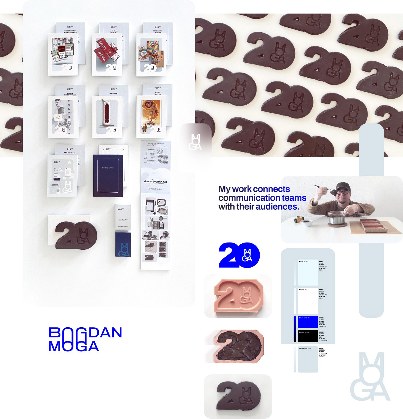
Continuing that line of reasoning, I wanted a symbol that connected letters as both typographic elements and graphic shapes. Again, my reasoning was strategic: what do I want the people to remember most importantly? My surname. I am fortunate to have a short, resonating surname, one that is easy to remember and enunciate: Moga. I decided to use these advantages and build a distinctive symbol around it.

The highlight blue is the most energetic blue color available on screens. It is the same blue used in the early web and on links that have no styles applied. It's that blue. The choice is intentional, highly energetic and vibrant, it also leverages situations where styling is not available.

Brand-Aligned Communication
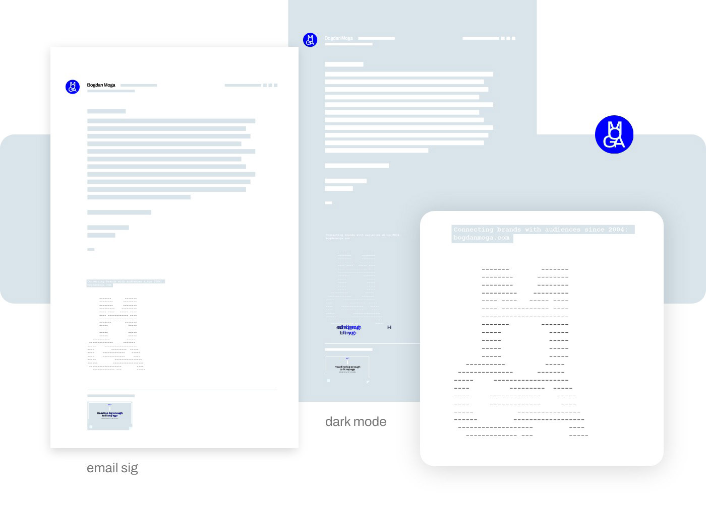
I've always had a problem with doing proper branding work on email signatures. And I know there are technical solutions involving image attachments, but I went a different way. I used my symbol to make a visual signature in the ancient tradition of ASCII art. This approach makes sure the symbol is visible in all conditions, since it is basically text, and it's distinctive.

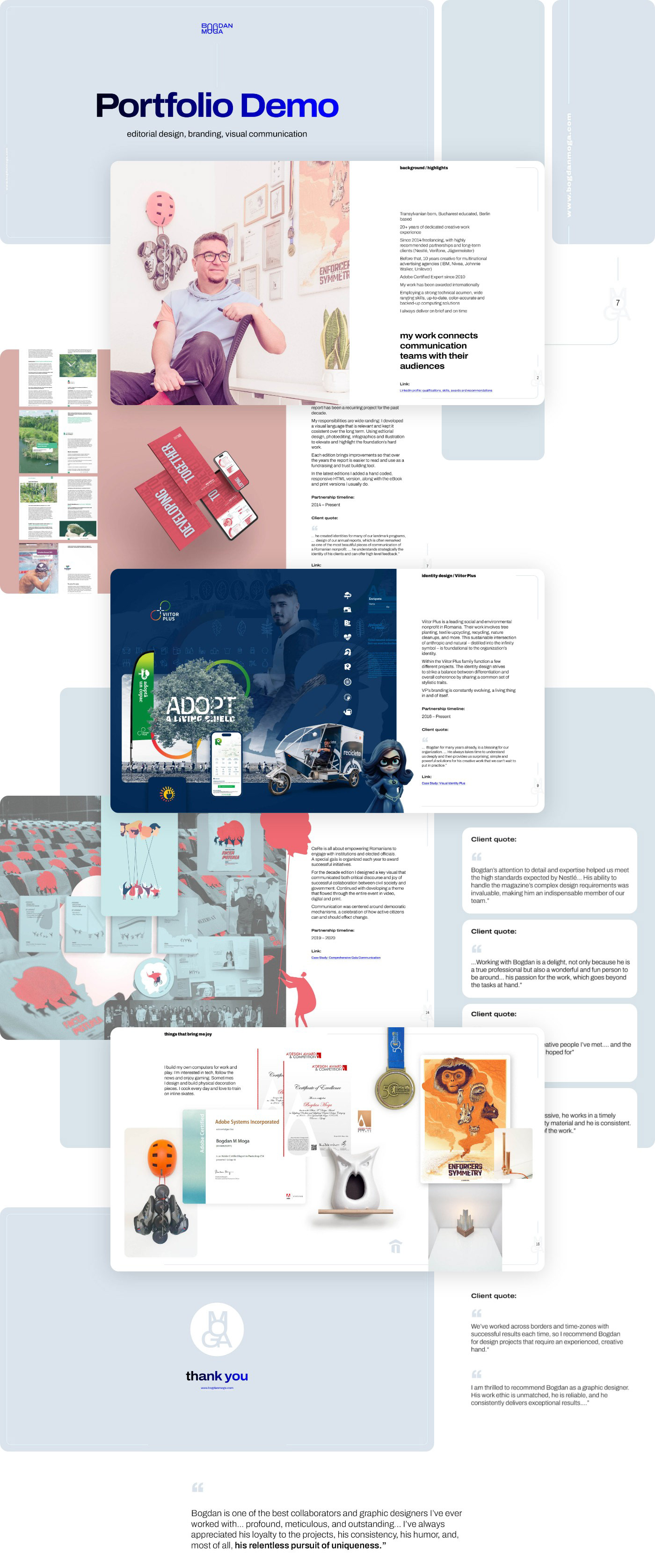
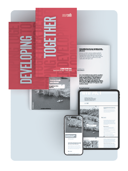
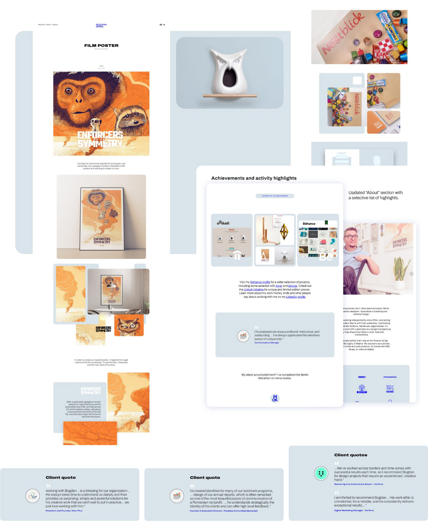
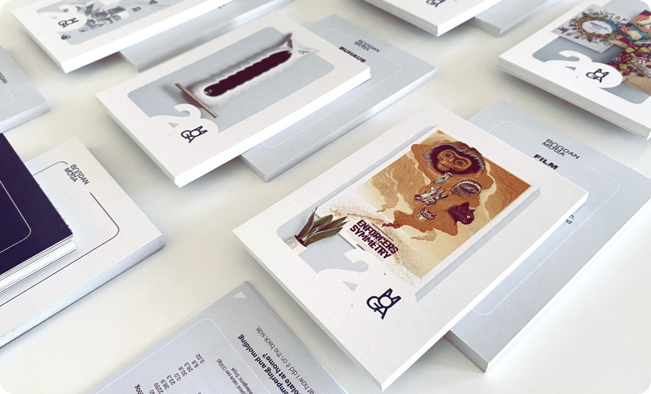
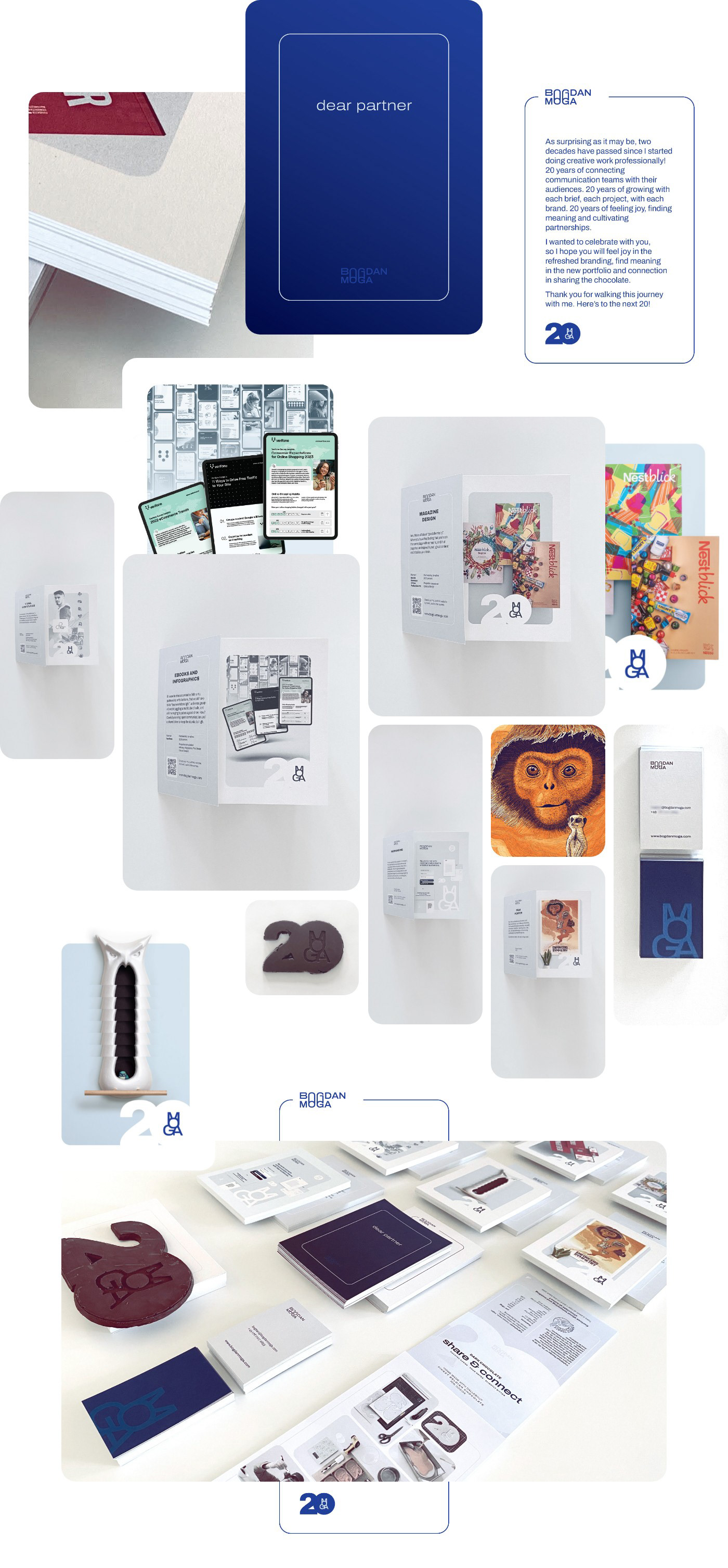
For the portfolio website I reduced the number of case studies, and completely reworked them. The intent was to offer insight into my process: use short descriptions, be consistent, engage the viewer.

The Celebration
How do I communicate the celebration and the new identity? How can I leverage my skills and bring something interesting and relevant to my audience? How can I make it memorable and engaging? My answer was chocolate.
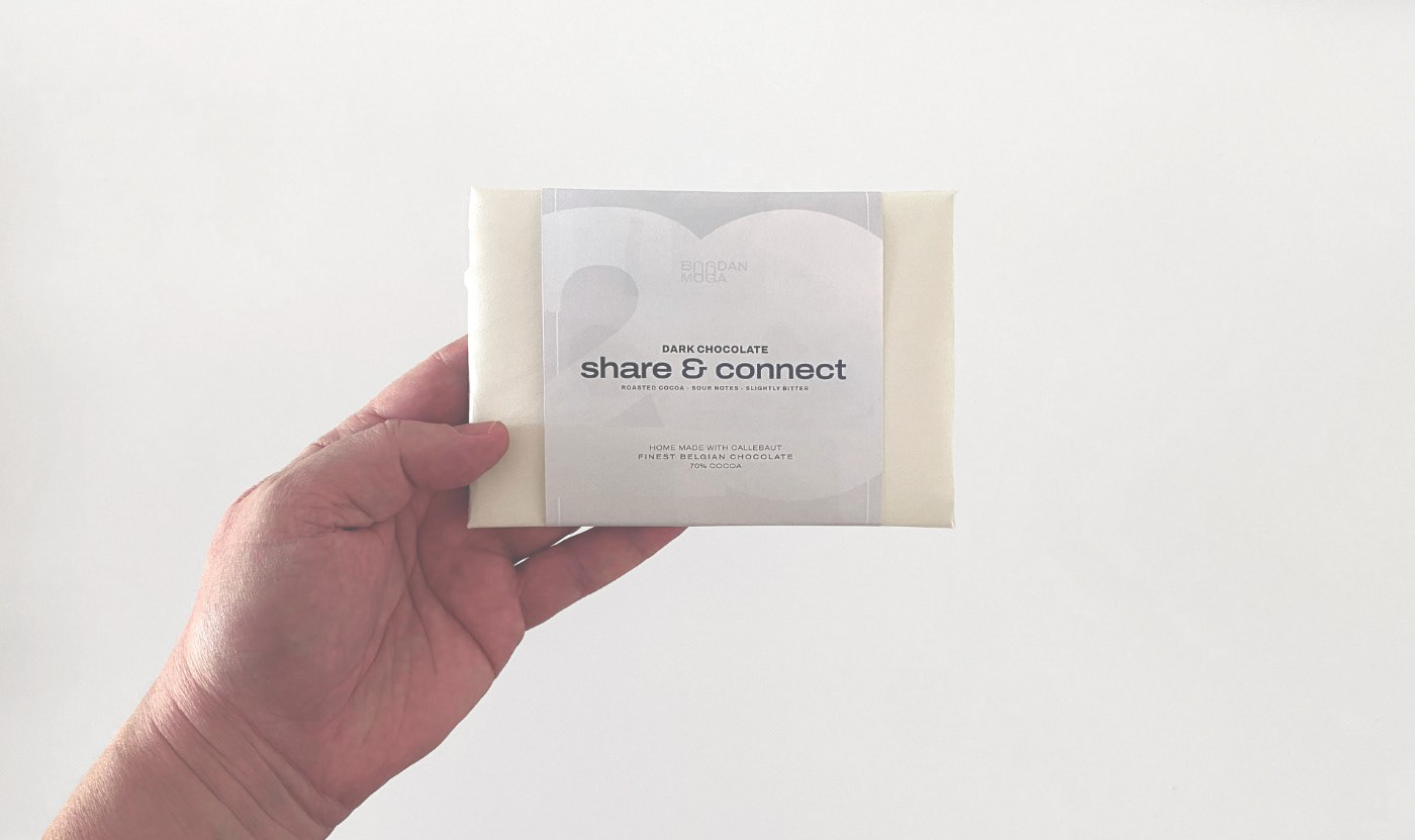
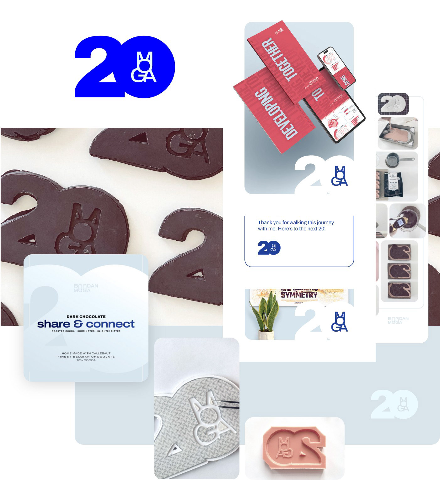
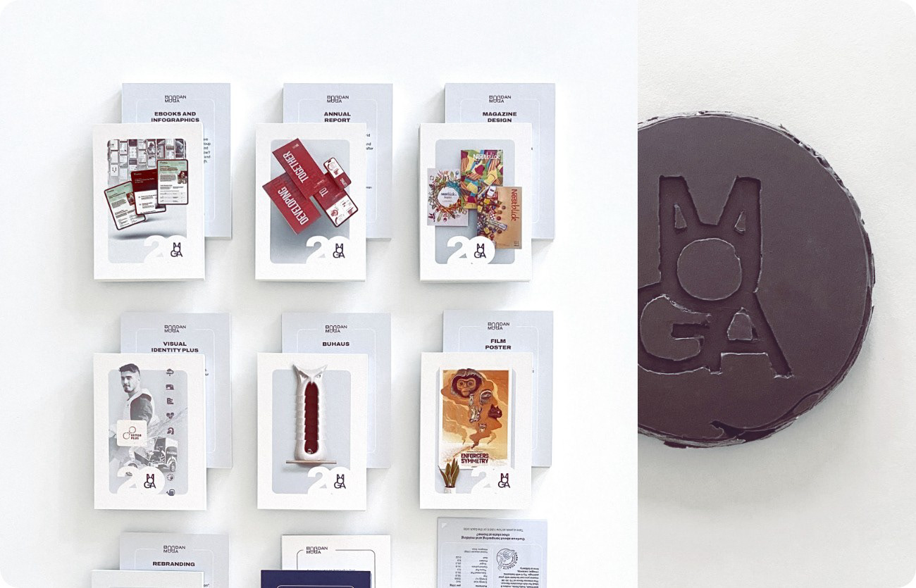
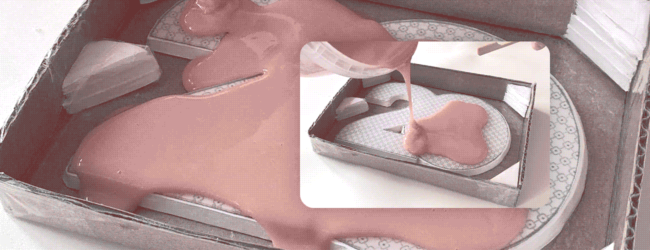
Using my experience in molding and mold-making on the Buhaus project, I imagined the chocolate to be shaped as the Moga20 symbol. This would reflect what I'm all about: custom, brand-aligned communication that is carefully executed, engaging and highly effective.
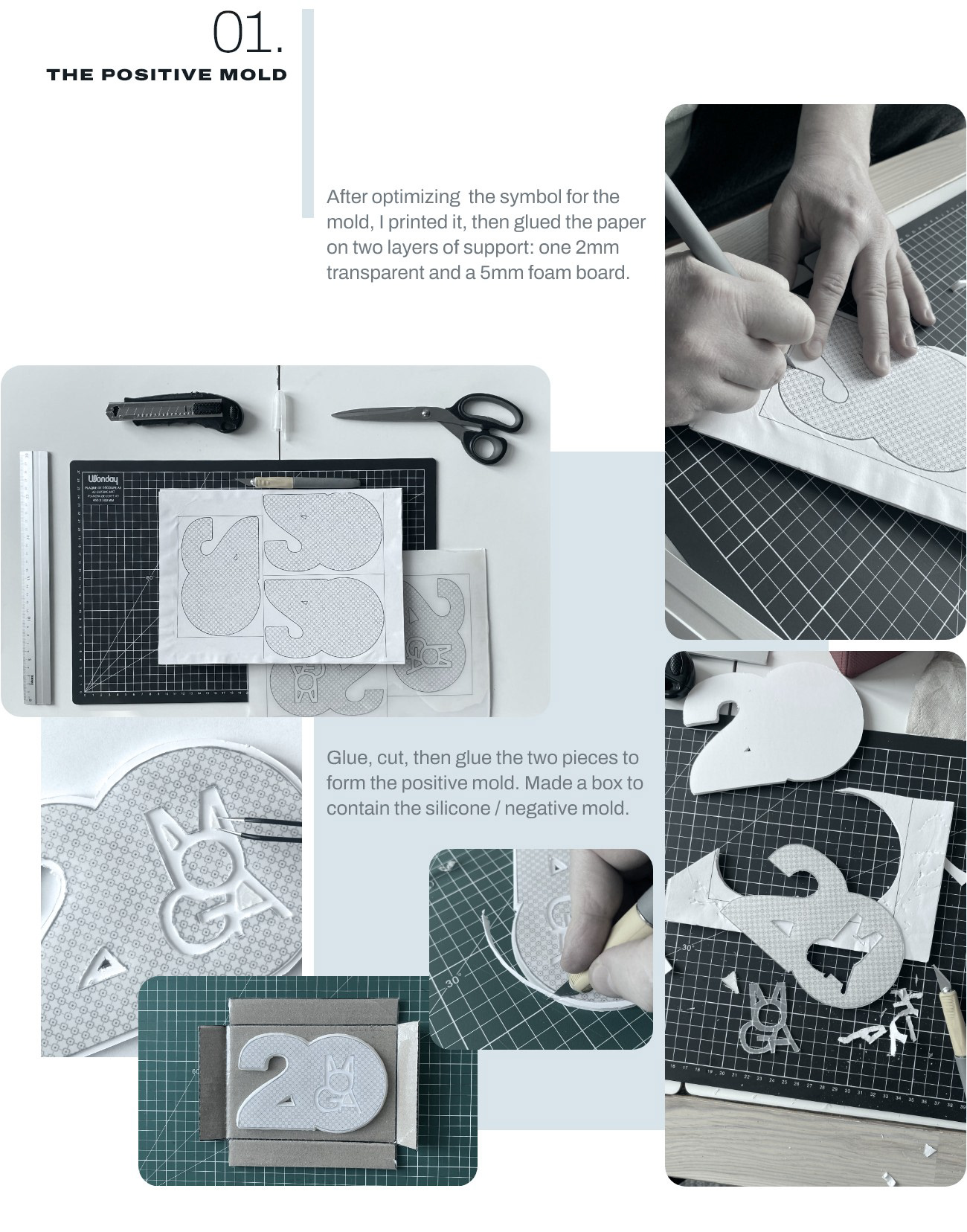
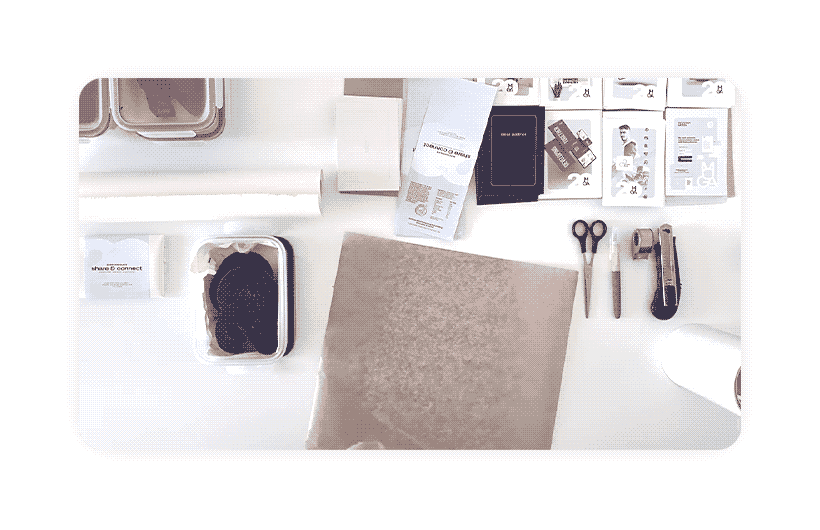
I knew nothing about tempering chocolate prior to this project. Did my research to learn about chocolate types, different crystallization methods, the importance of temperature. Doing it in spring was not coincidental.

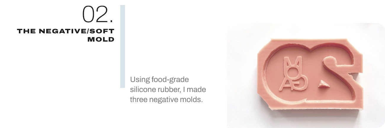
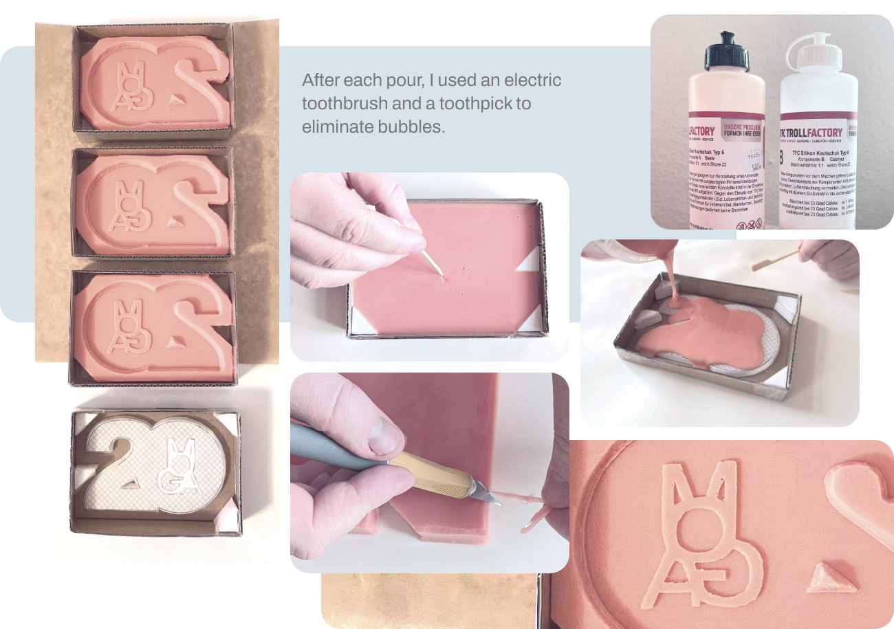
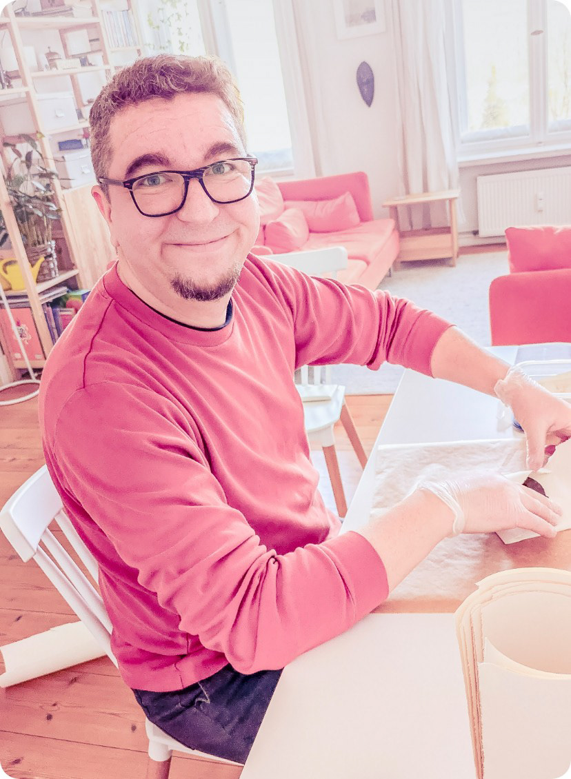
Throughout the course of this project I used food-grade materials, gloves, head coverings and a strict regimen of cleaning and washing. Even though this would be home tempered chocolate, I did not want to compromise on taste, safety or looks of the final product.
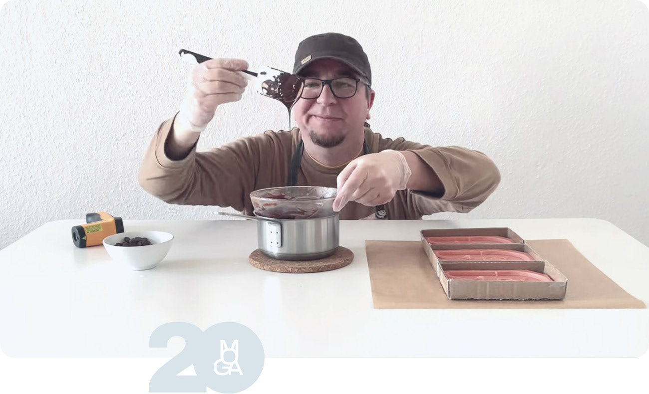
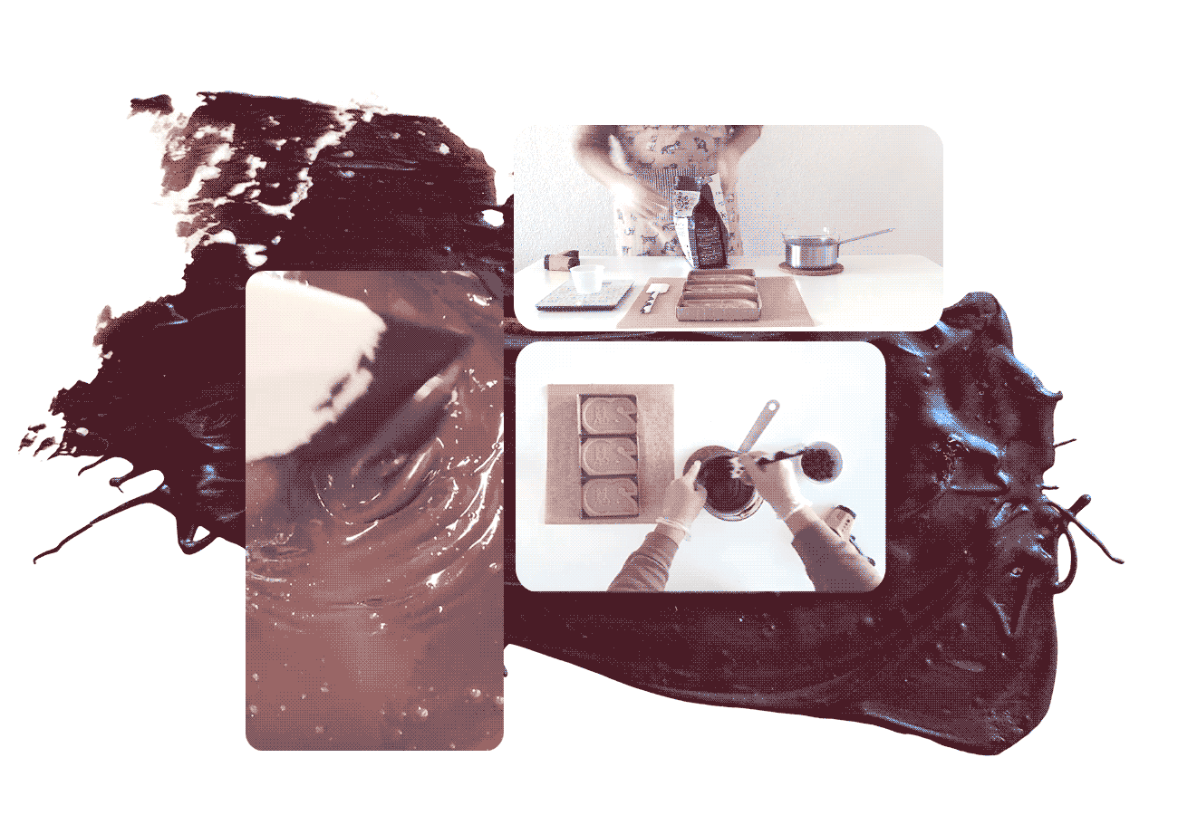
After prep, first step is to weigh the batch of chocolate: two thirds for melting and one for seeding. Then gently warm the bowl over hot water, mixing and measuring temperature constantly. Then adding the seeding chocolate, mixing some more and pouring into the mold.
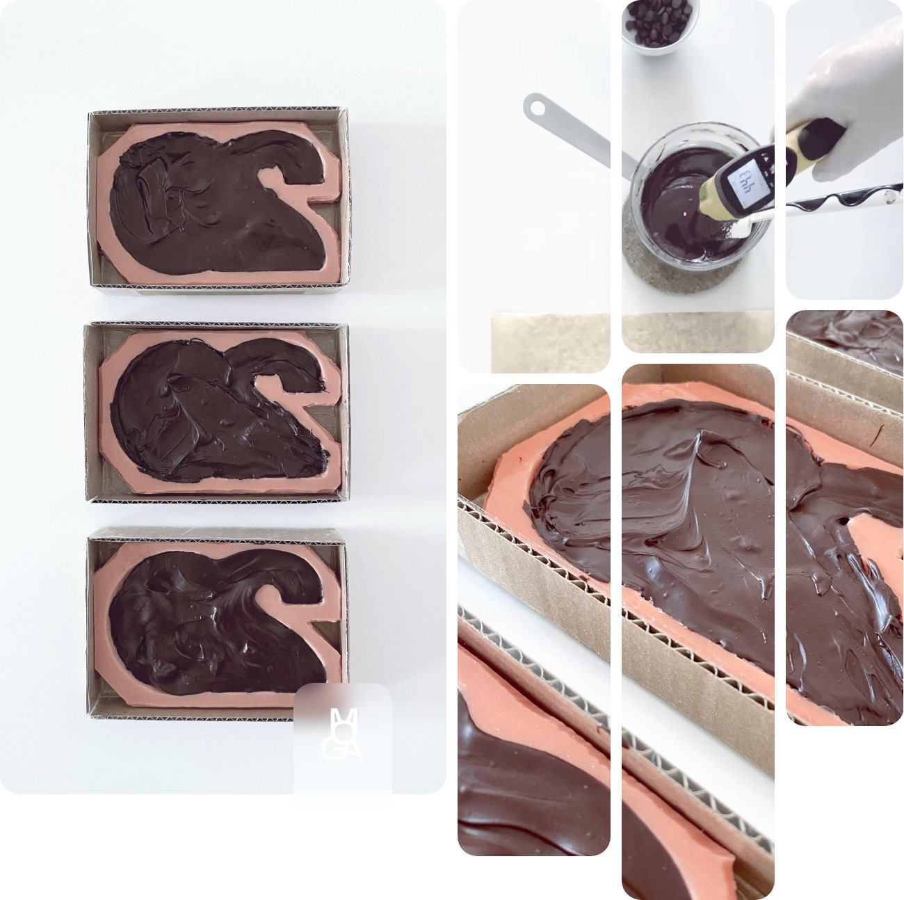
Photographed here was my first pour. For the subsequent ones, I learned to better calibrate the heat and to vibrate the molds for much smoother surfaces on both sides.
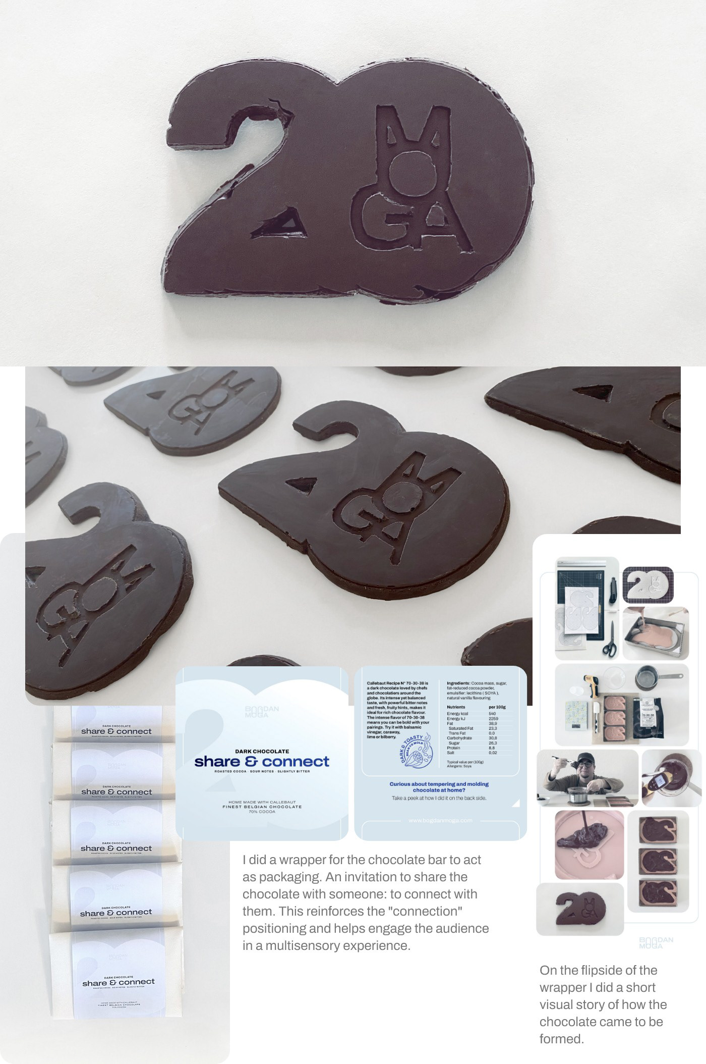
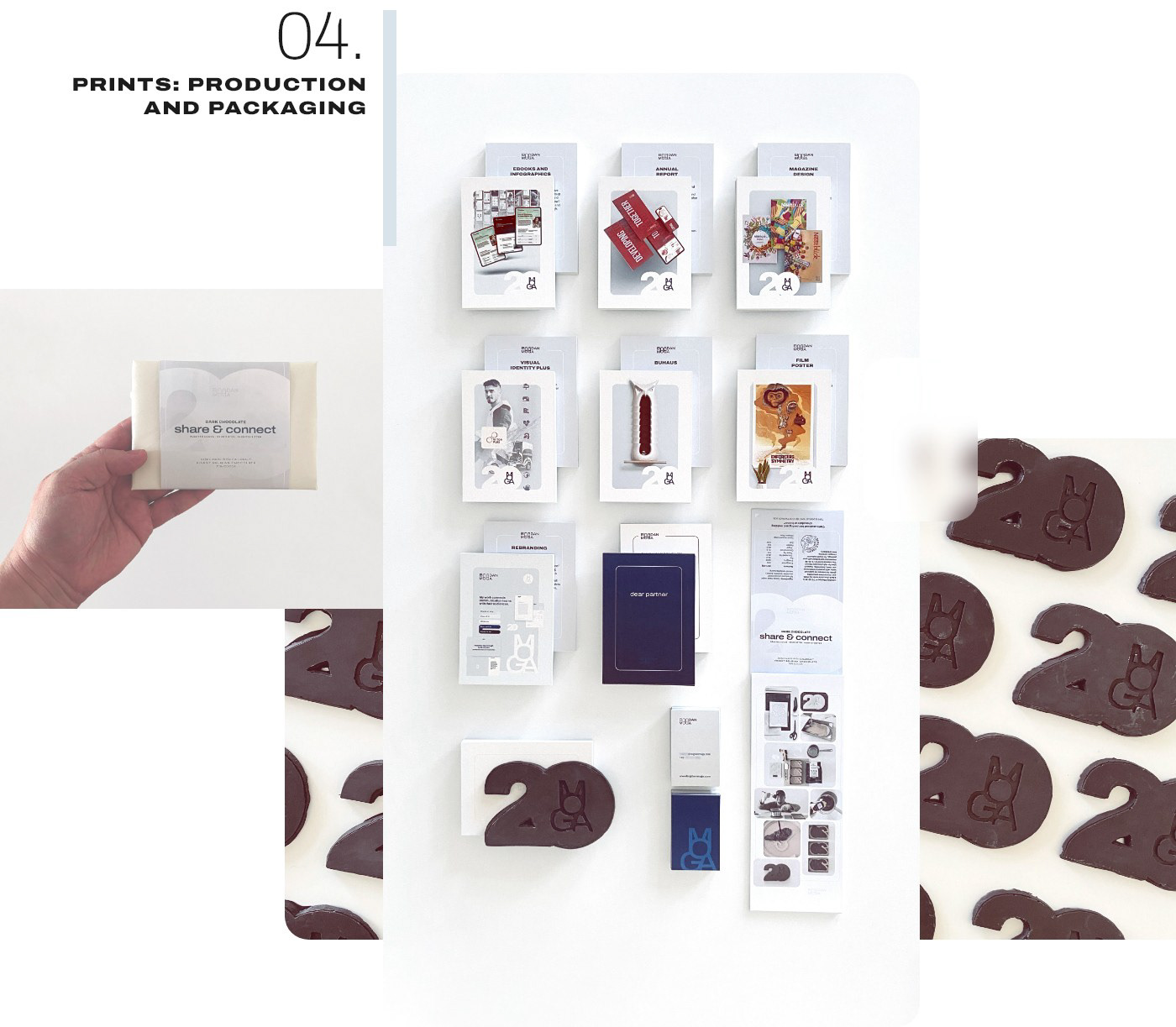
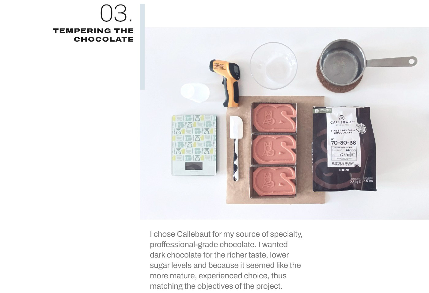
I used chocolate from Callebaut, print production by Sedruck, food-grade silicone rubber from Troll Factory, and crafting materials from Architekturbedarf. The complete project, with branding, online portfolio, communication design, and celebration package took about five months to complete - not exclusive, of course.
Results and Measuring Success
All in all I ended up doing a few dozen complete packages that I sent to work partners and loved ones. The feedback I received ranged from enthusiastic to non-existent. Most of the people reached out to share gratitude for the nice surprise and to congratulate me on the anniversary. They said they loved the chocolate and told the story of sharing it. Some were really excited, some were impressed, some were grateful for the nice surprise - a sweet distraction from the day's challenges. A common theme was how they felt the project was very "me". In the sense that it was detailed, carefully executed, involving a range of skills, with impactful written content.
The project helped people get to know me and my work a little better. It fostered a cooperative, optimistic attitude which in turn led to recommendations, new projects, new clients.
During the design of this case study I was showing my daughter some of the work and talking with her about it. Remembering how we worked together on the molds, how great the chocolate tasted and all that. When we reached the part about the Moga symbol, I asked what she saw. And she got excited, started explaining and gesturing with her hands and fingers and lots of body language, telling how this is that and how the letters are this way and she kept going for a few minutes. I sat there in silence, smiling.
If my work gets my 5-year-old all fired up, then I feel like I've achieved something.