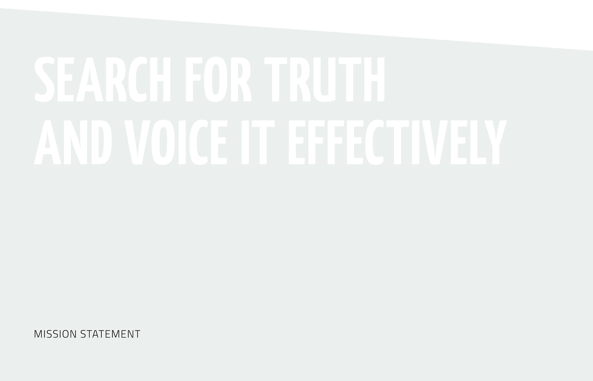
Tech4Stories is a TechSoup Europe project aimed at improving the communication capacity of NGOs fighting discrimination, defamation and misinformation.
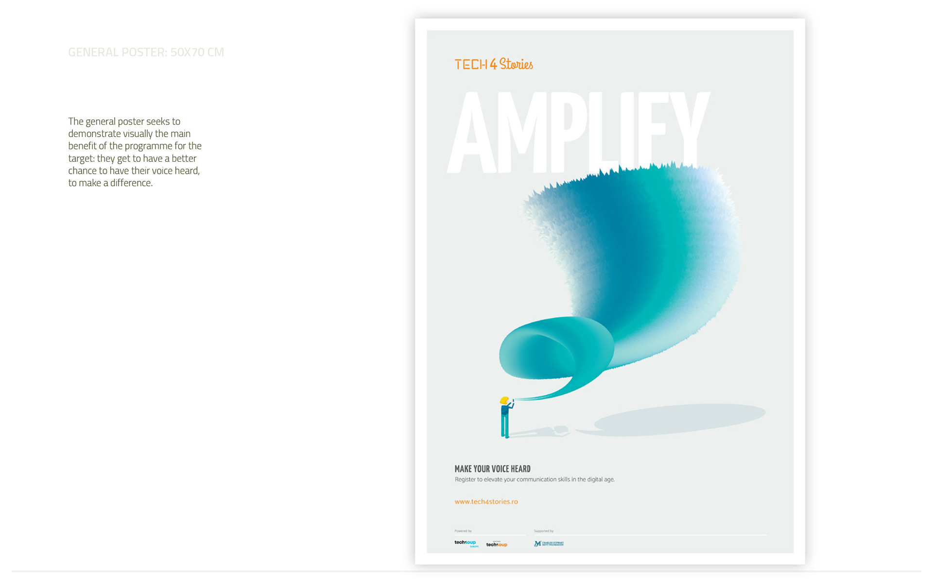
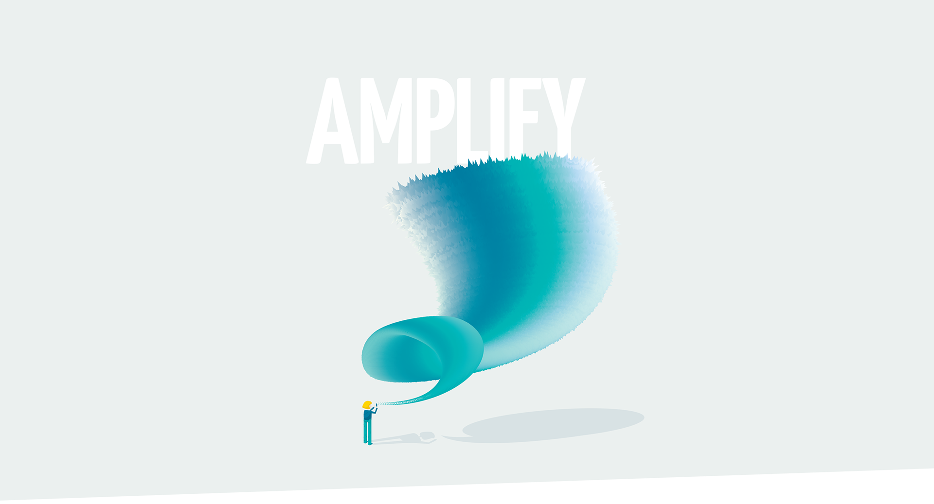
The challenge here was figuring out how to combine the strength of each of the two sides of the same coin, reason and emotion. And to enable the stakeholders to take action and use the resources available to great effect. We wanted them to feel like they can amplify communication for good, just as bad actors do so for nefarious purposes.
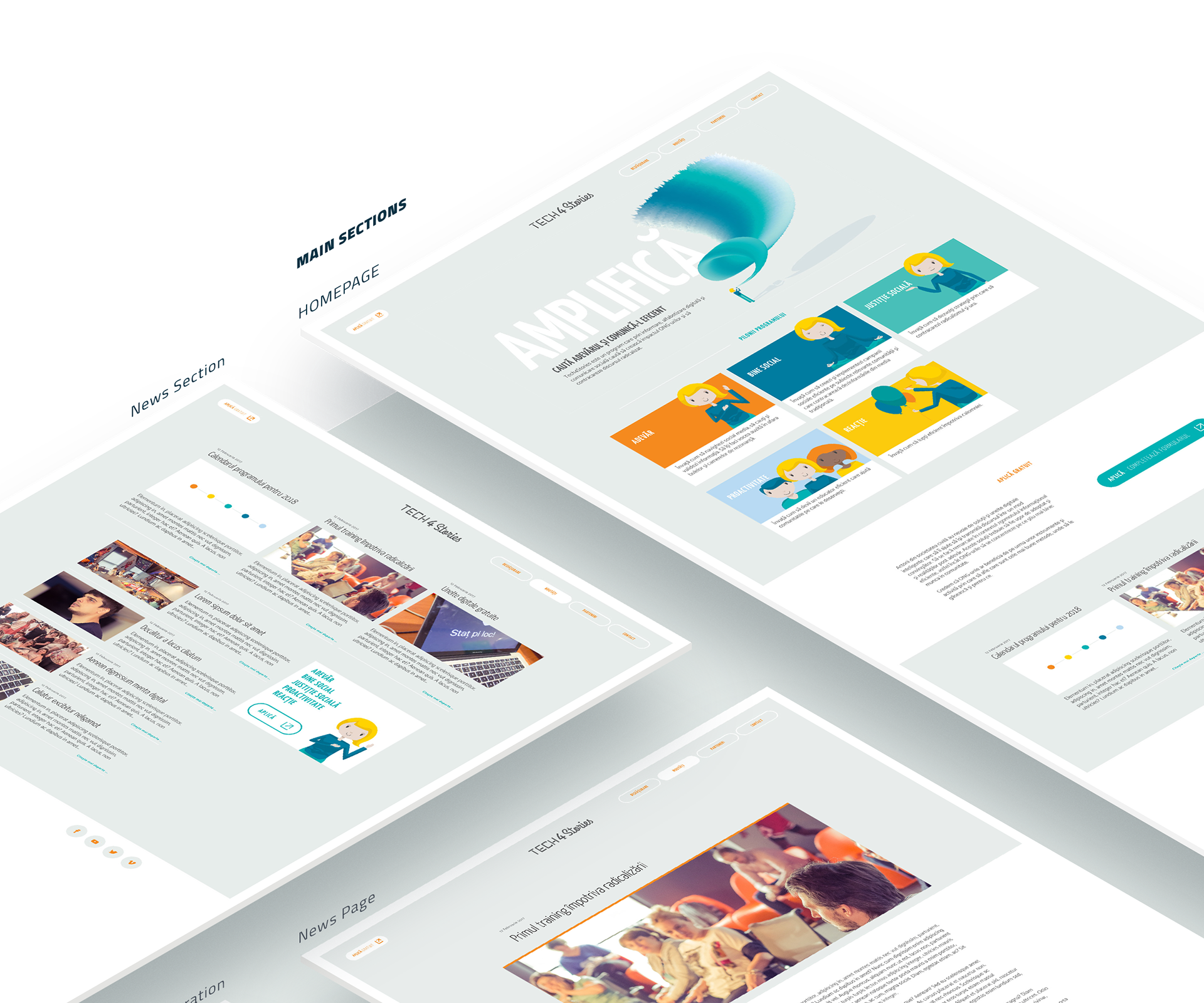
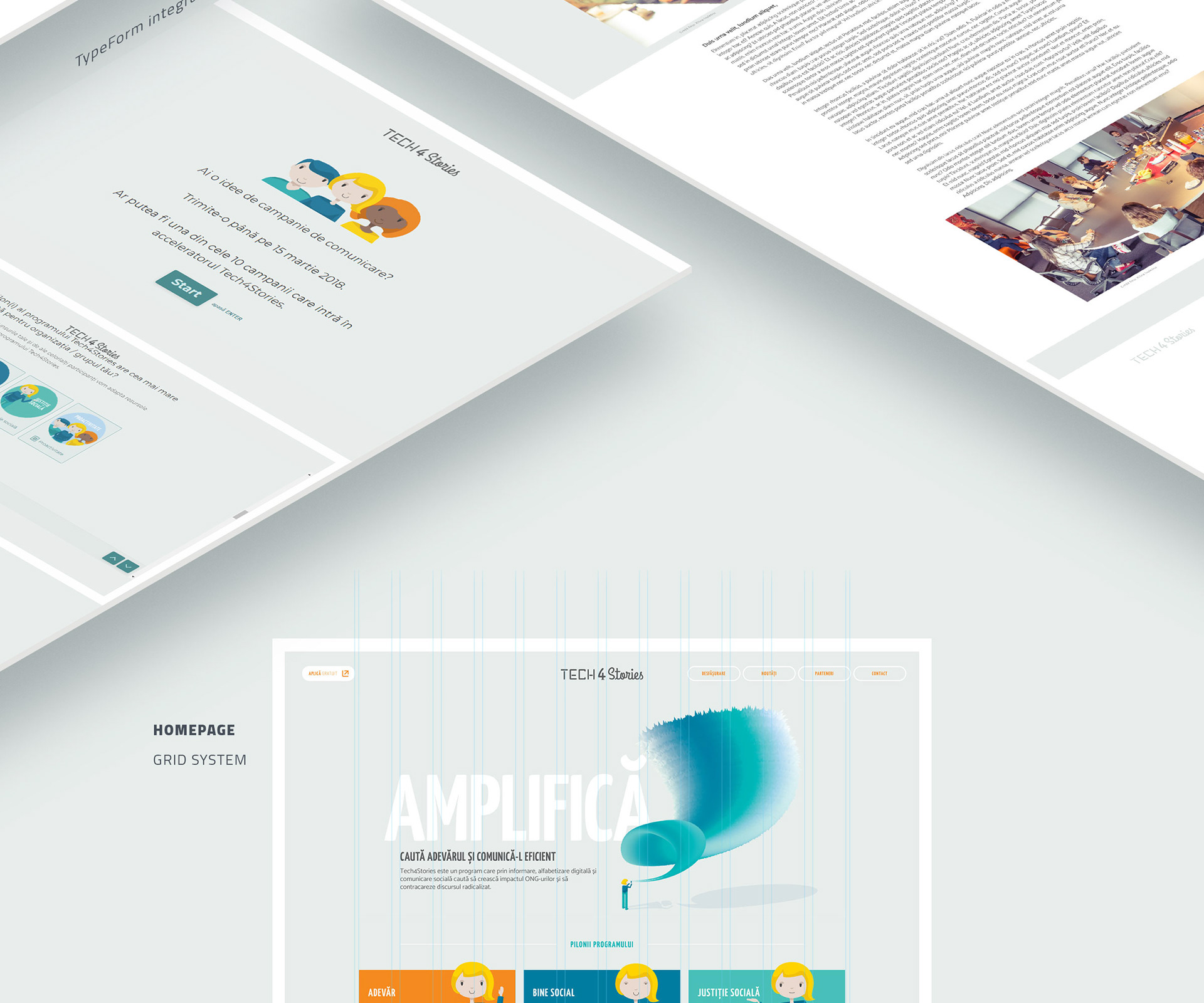
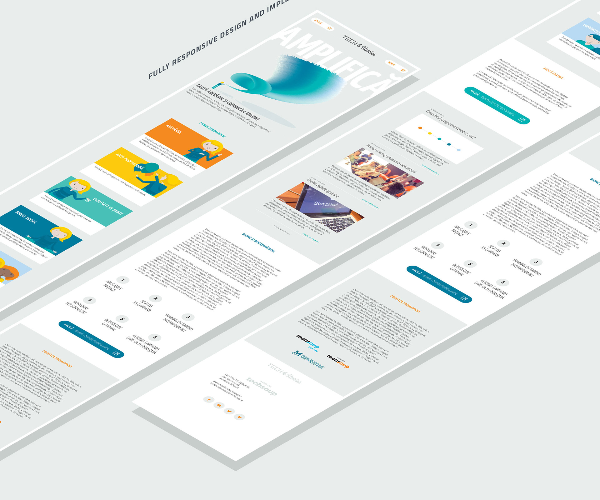
So we created a tight set of identity elements, compelling key visual and promotion message, a web presence plus TypeForm personalization and a series of digital communication materials.
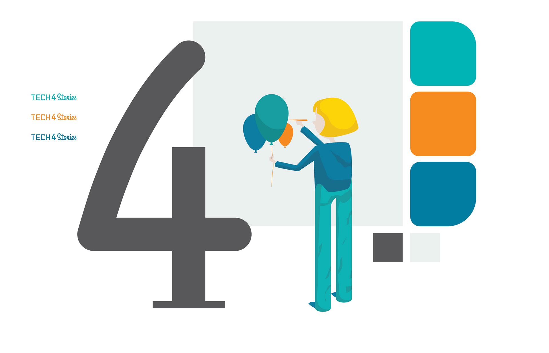
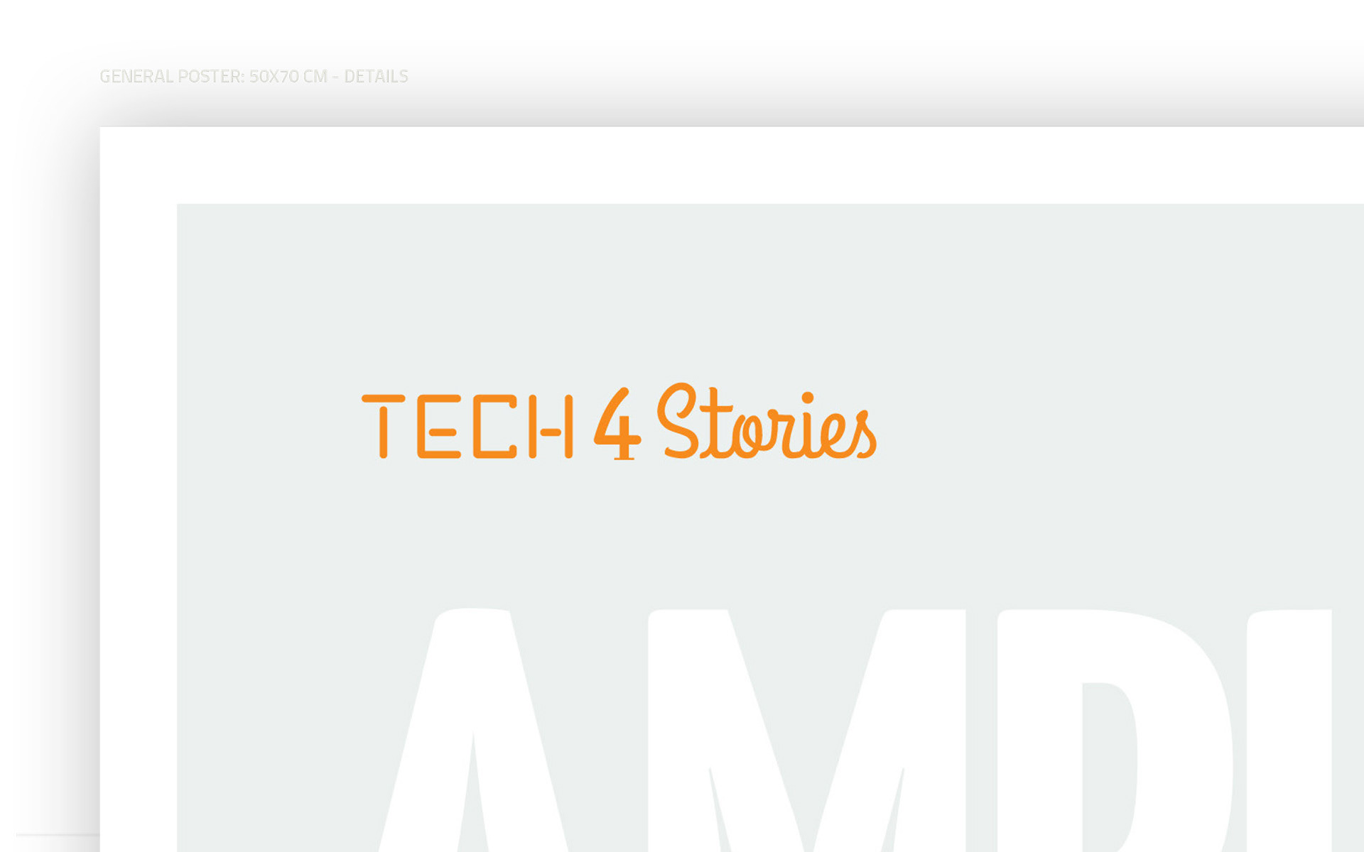
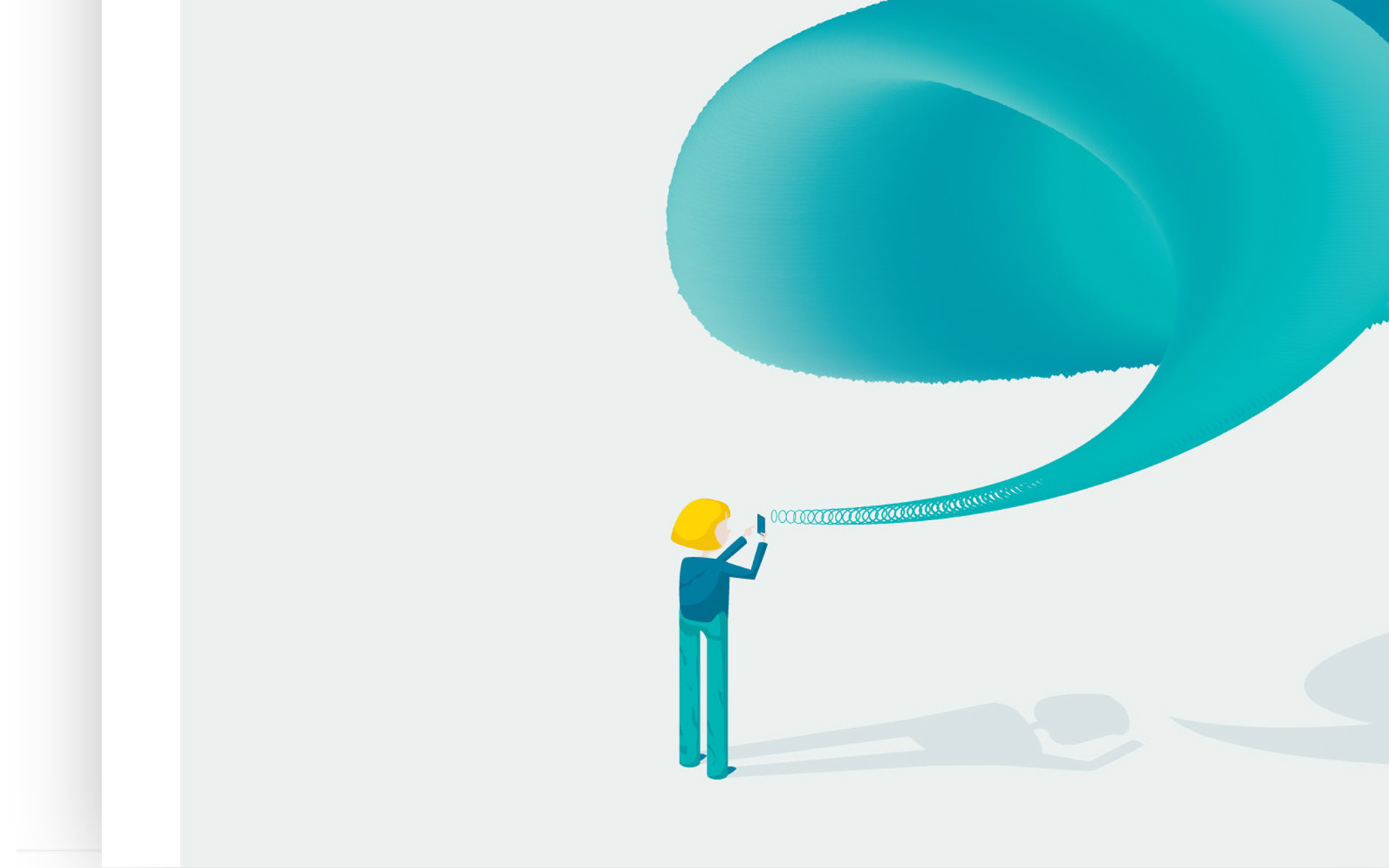
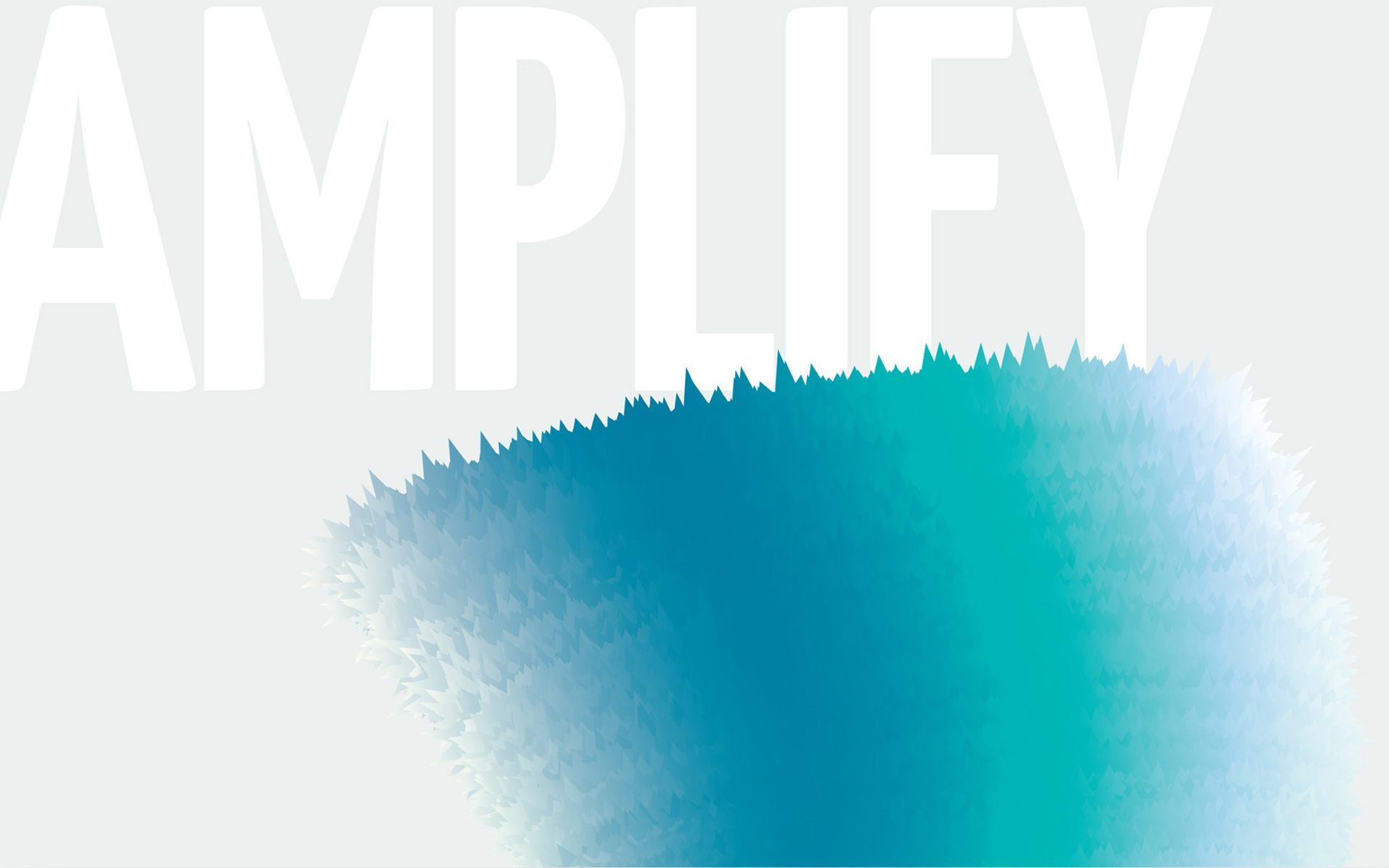
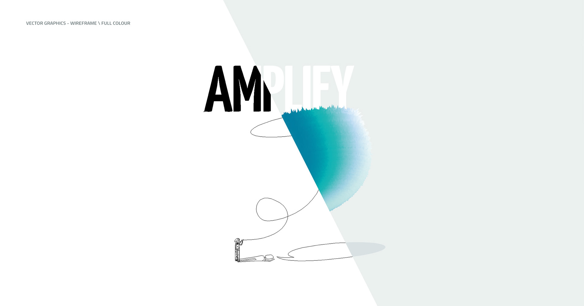
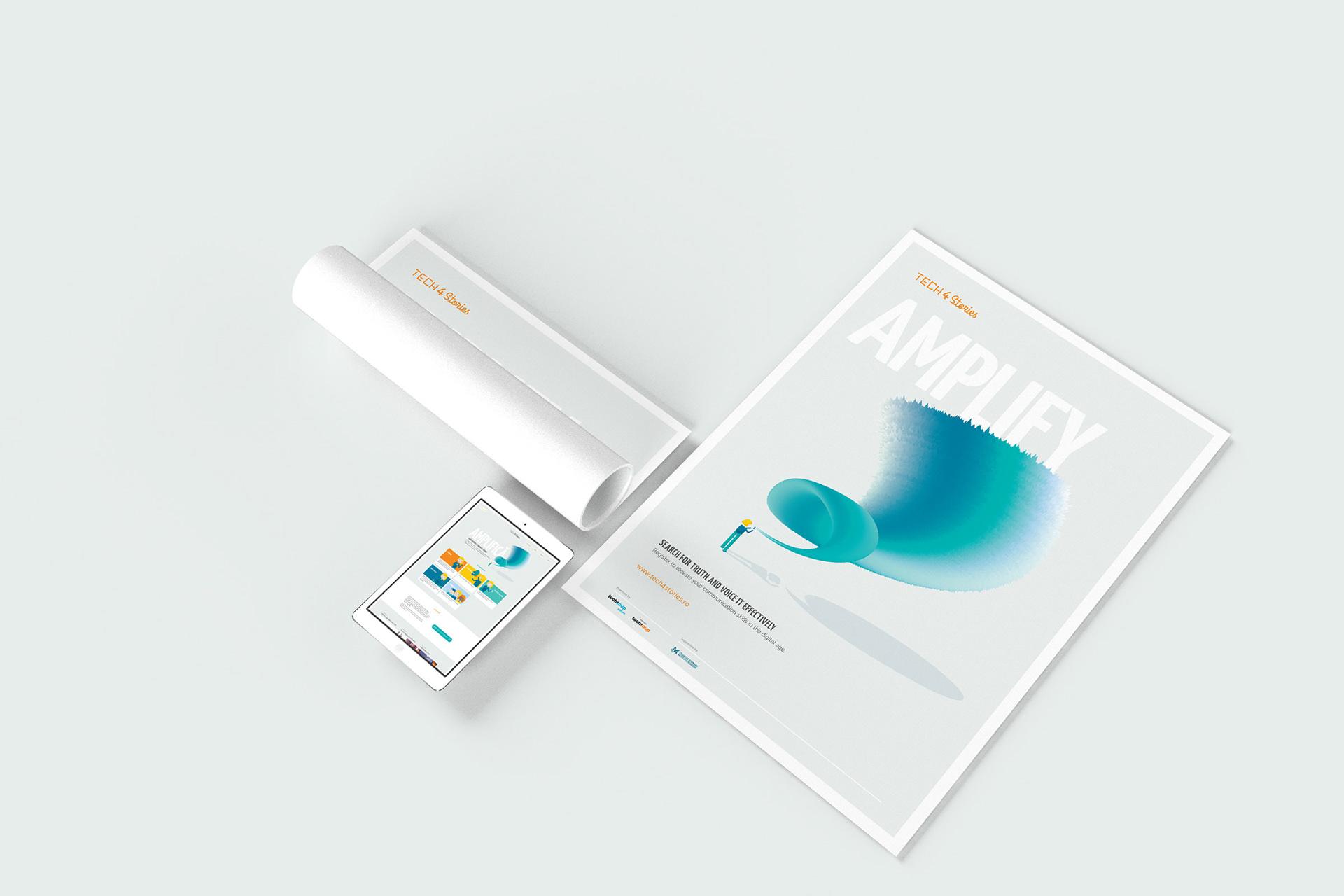
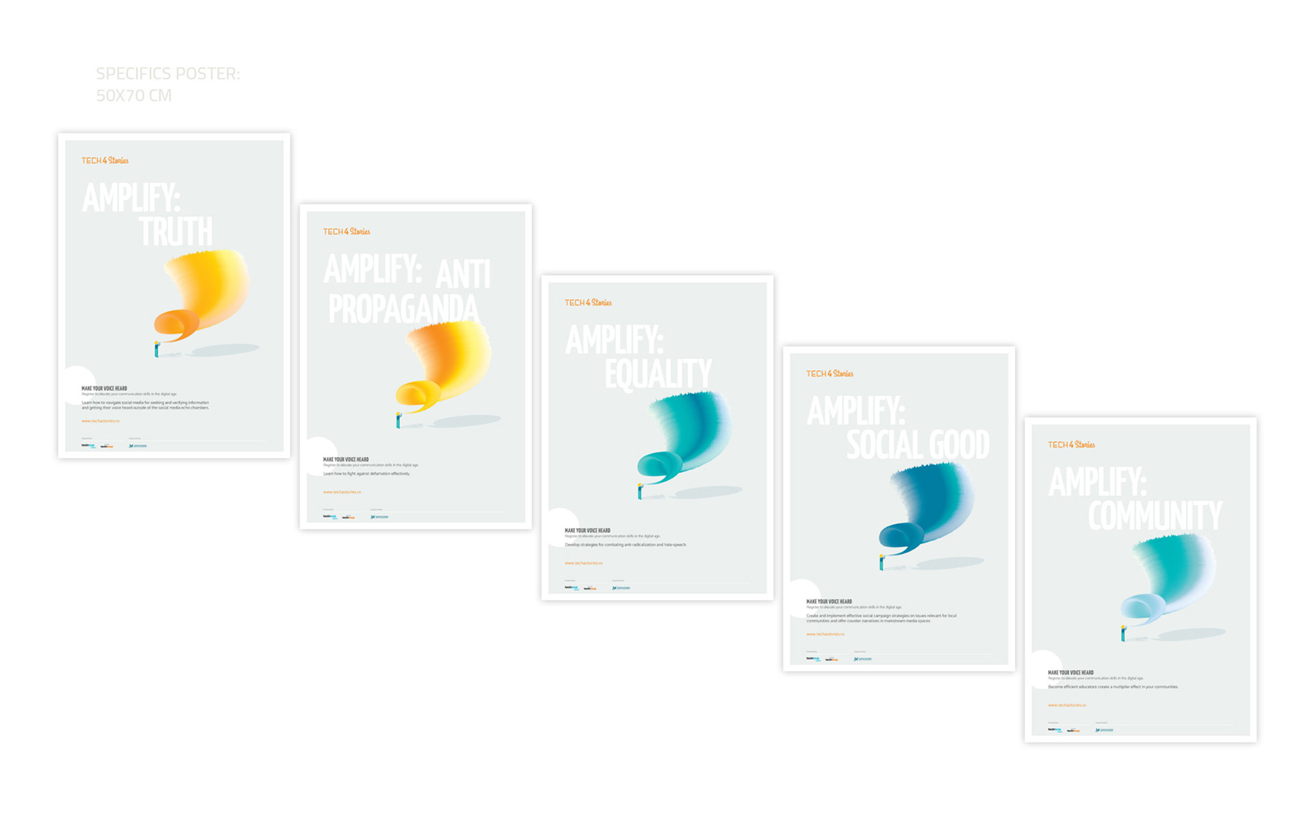
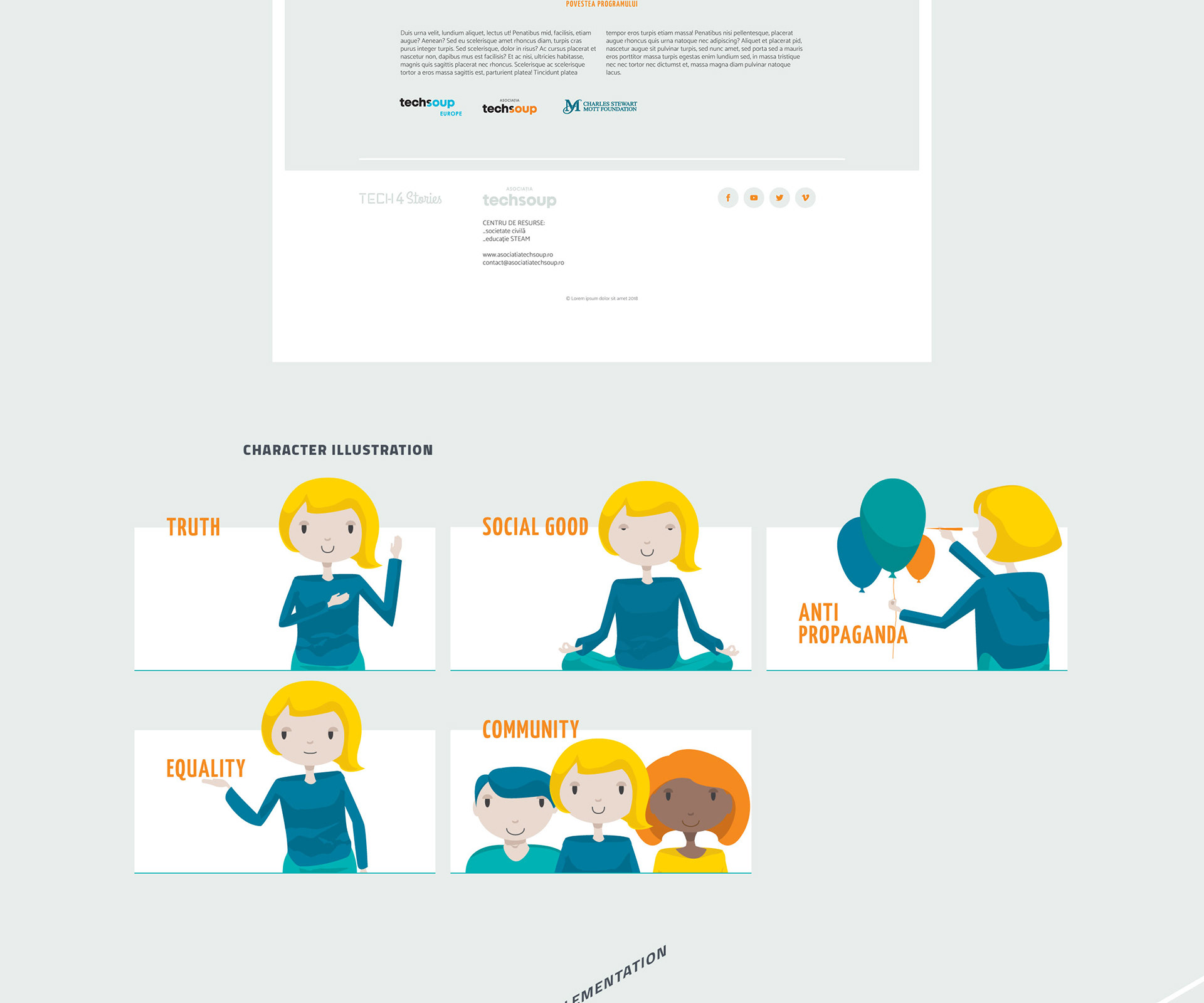
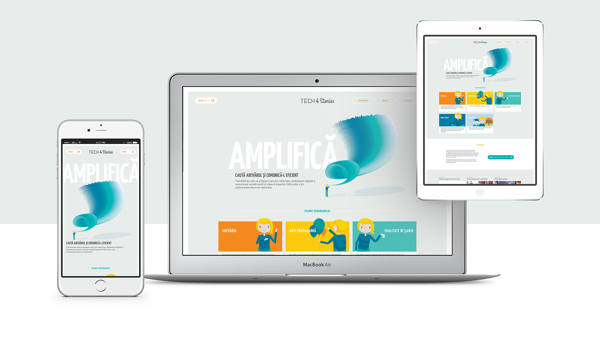
The identity and communication of the project was built around the idea that a duality of seeming opposites can be harnessed to achieve powerful results. Conversely, the logo joins a thoroughly technical, sans serif type, with a handwritten, human and unapologetic part. The key visual portrays a relatively small person having a big impact. Using both big and small type on everything. Strong and subtle tones. Big ideals in short sentences.
As an example of subtle cues, did you notice the speech bubble below the amplification horn of the key visual?
Another interesting aspect of this project for me was keeping everything vector, illustration, wordmark, even the amplification horn. So even for the execution I drew a parallel to the concept of the project, mixing math with humanities to enable compelling solutions.