

The Client
Viitor Plus (translated as Future Plus) is an Non Profit Organization working towards sustainability in areas of environmental and social protection. VP is a growing, important player on the Romanian landscape, with many achievements during 15+ years of activity.
The Brief
Redesign the identity system using a modern approach that would help towards achieving the objectives.
The Challenge
Each of the NGOs projects benefits from a communication platform that is distinctive and well defined for their mission, while sharing an overarching visual theme.


01. Logotype
Imagine a shape that combines the infinity symbol with a plus sign. Also, imagine the two loops representing the natural and anthropic environments that are always in an evolving relationship. This is the distillation of the organization's mission into a simple, easy to remember identity sign.


02. Logotype in motion
Short animation of the VP logotype, to be used as an outro sequence for video projects.


03. General Key Visual
A general Key Visual suggesting the vision and mission of Viitor Plus: blending the natural with the man made in a way that is responsible, sustainable and healthy. Enabling a better future for the next generation, closing both loops into a symbol of growth, connecting the dots of technology and empathy, through direct action and leading by example.


04. Program Logotypes
This is a list of the current projects logotypes. Among them, there is a social enterprise that produces sustainable textile wearables, one that collects recyclables using nothing but pedal power, a tree planting initiative, a crowd sourced recycling map.


05. Color System
Developed a vibrant, flexible chromatic palette that shares some of the colors, adds gradients and secondary colors where needed and helps create a cohesive yet distinctive look.


06. Typography
The typographic setup keeps Varta as a family used across all brands for body copy, and Titillium Web, Enriqueta, Mulish and Mukta for wordmark and title use.


07. Tone of Voice
Developed a visual tone of voice guide to help orient and align the communication. That way it's easy to see that while Recileta has a "trendy" leaning with a "story" feel, Adoptă un Copac is more ”family” oriented with a ”story” vibe.


08. Web Presence
All project homepages share a common footer that displays information on all the other projects and ties everything together visually.


09. Programs Overview
Eco Provocarea (Eco Challenge) is promoting responsible environmental attitudes, educating high schoolers and their teachers. They clean, recycle, reclaim natural habitats and volunteer for a cleaner environment.

Each project received a BBS. A Branding Brief Sheet is a one page document describing the most important branding pillars: logo, colors, typography, tone of voice and positioning.


Recicleta (Recycling Bike) is aiming to reduce the need for new resources by collecting and cleanly transporting recyclable materials. They mostly use cargo bikes to move around and thus reducing the carbon footprint and improving air quality in the city. Homepage here.

The Recicleta cargo bikes are what sets them apart and is the core of their activity. We went for a proud and loud branding execution here, using the brand symbol to emphasize the brand's role and attributes. The wheel keeps turning forward, and materials are used and reused.


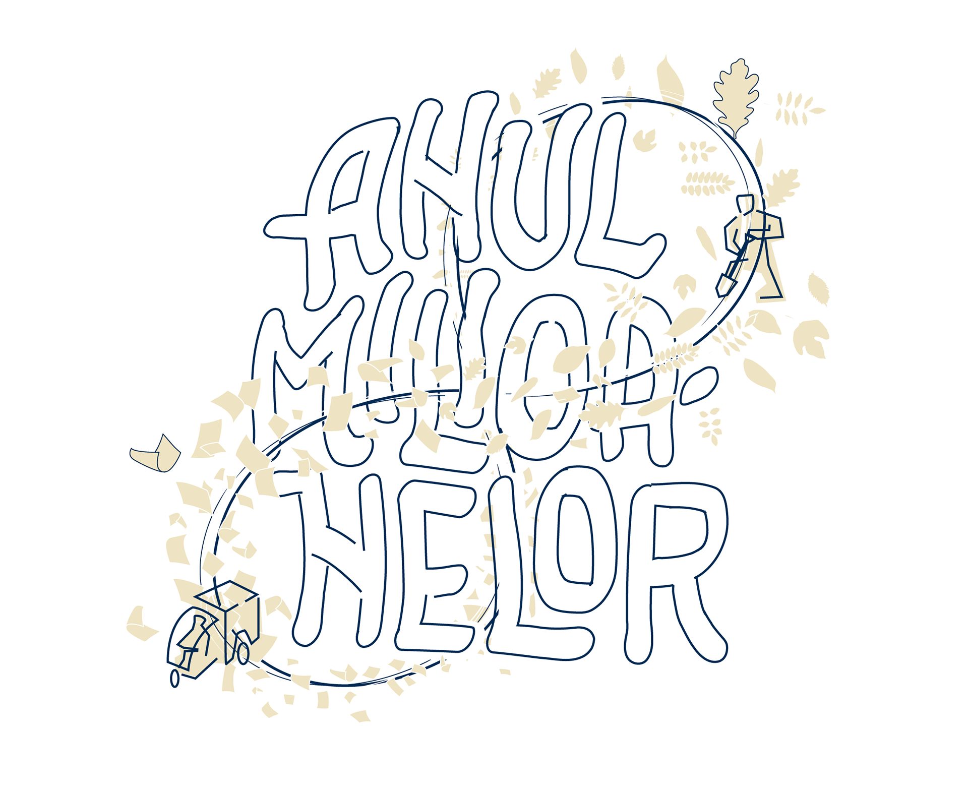
Adoptă un Copac (Adopt a Tree) is a project aimed at reforesting and thus reclaiming areas in danger of desertification. Together with a large volunteer movement, local government support and private sponsorship, they have planted 123.000 trees in 2020 alone, and one million trees in total by mid 2023. Website here, FB page here.


10. Brand Aligned Communication
To mark the celebration of 15 years since the founding of Viitor Plus, we created a special symbol, derived from the VP symbol. We also developed a Key Visual to help communicate the results VP has had over the years.


11. Brand Book
VP branding: all rules, examples and communication guidelines are included in a comprehensive 150+ page Visual Identity Guide.